User centered web navigation
Determining if progressive disclosure or staged disclosure impact usability of an online booking stystem.
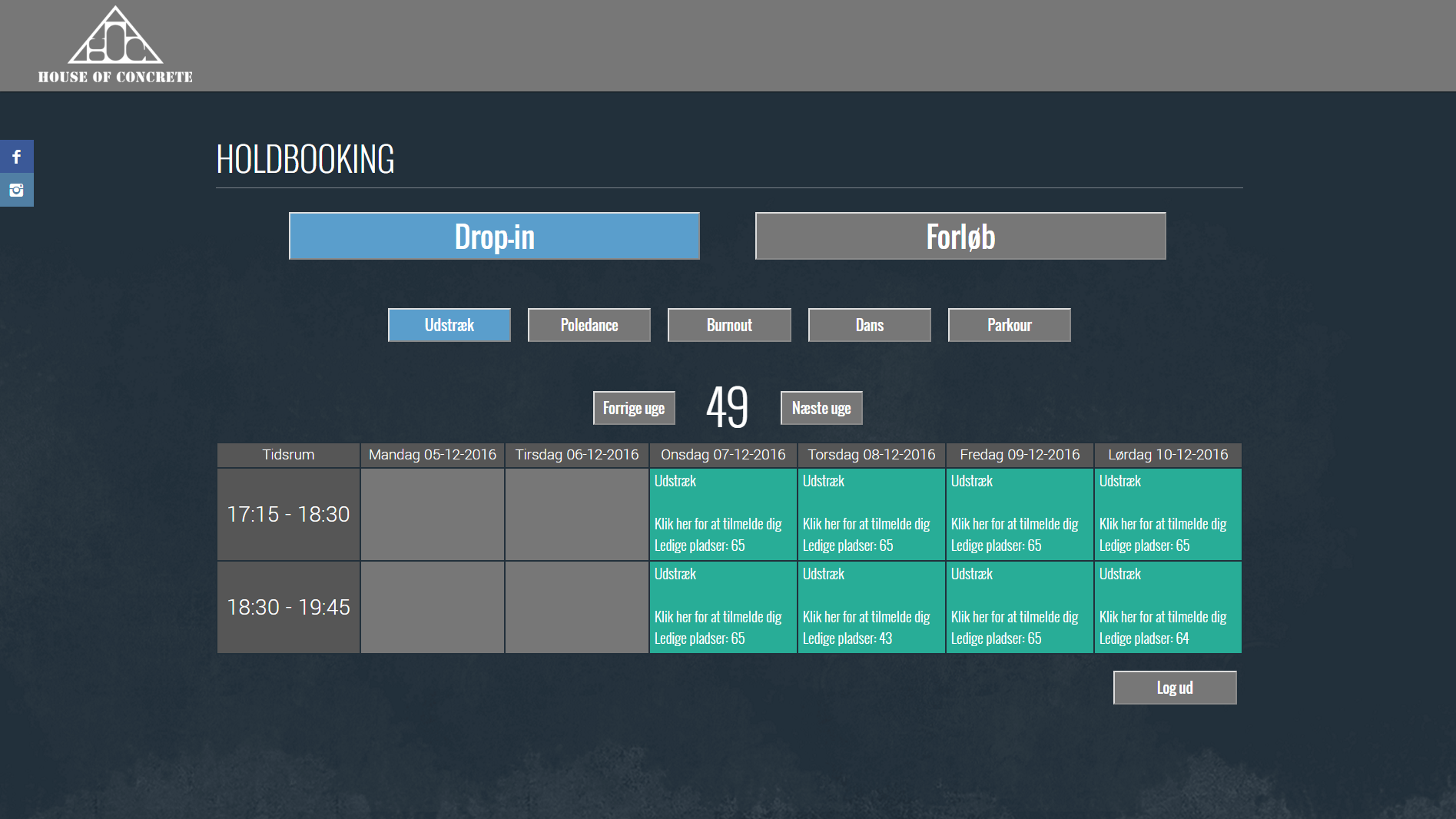
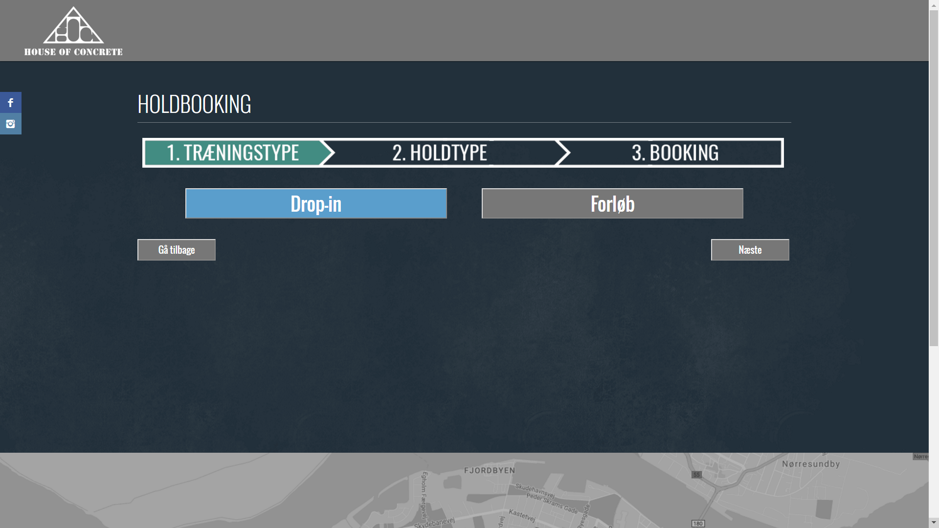
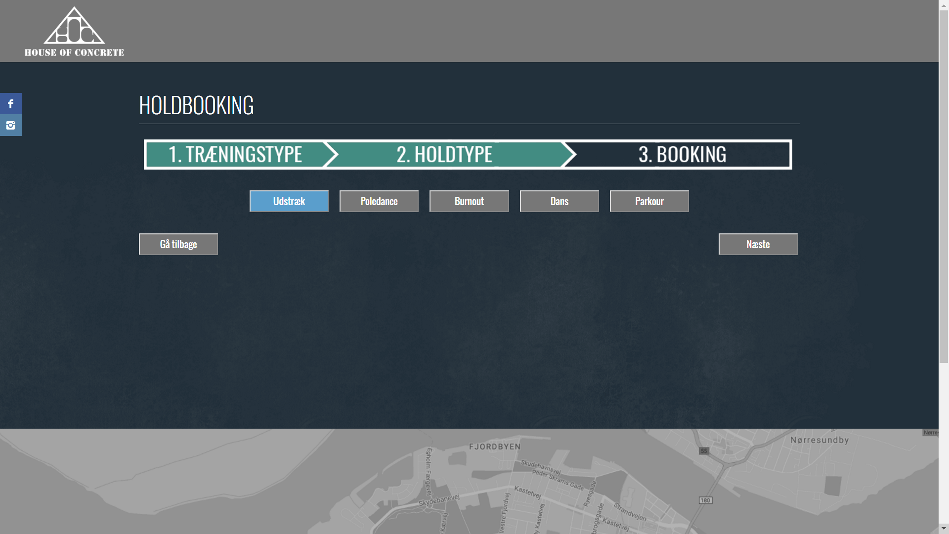
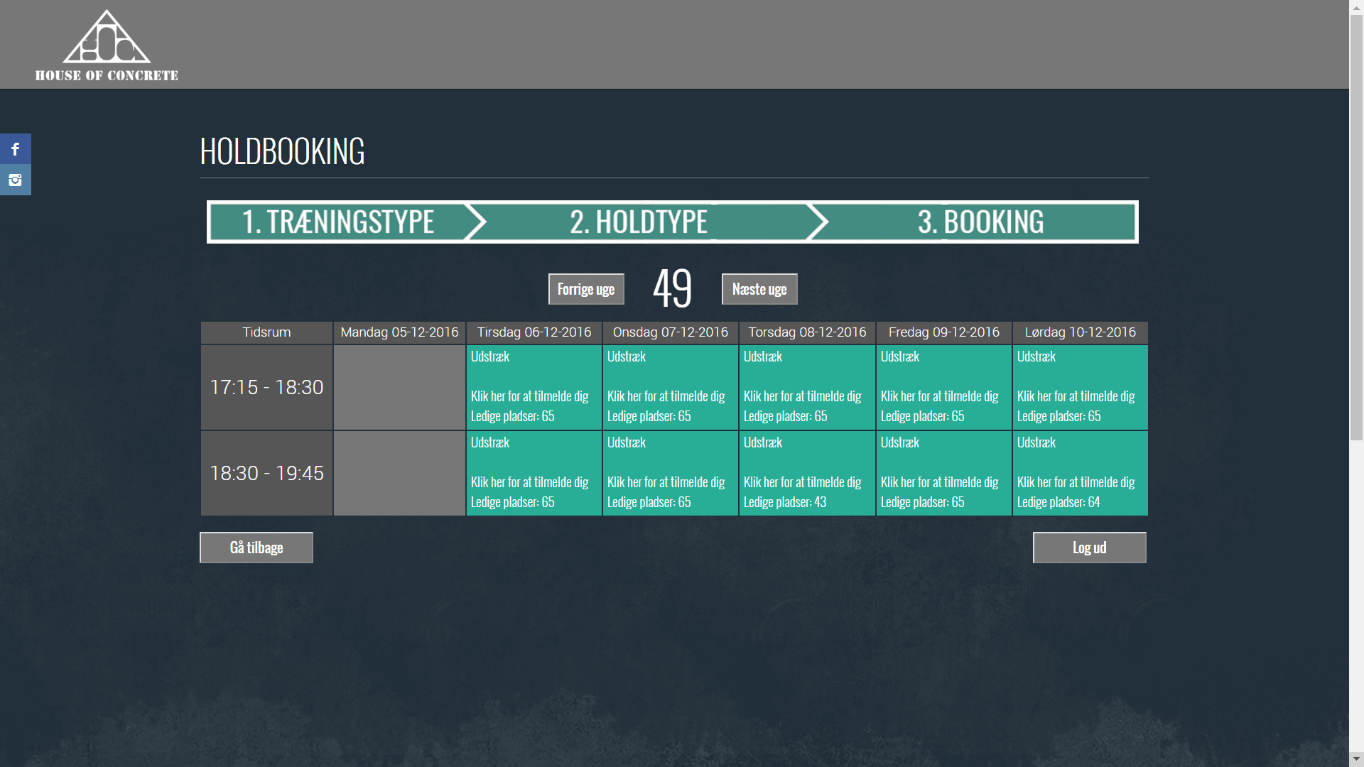
I had an hypothesis that progressive disclosure was faster, but harder to use for first time users when determining which navigation to design a web application with. So when a Gym approached me about designing a UI for their online booking system I jumped on the opportunity. In short, progressive disclosure is showing all relevant choices to the user on one screen, whereas with stages disclosure only one choice is shown at a time. The visual designs are made within the customer's design requirements, regarding color choices, information shown and more.
To test this, a small sample of 12 men and women from the gym is run through two prototypes of the booking system designed with each navigation style. They are given the task of booking several time slots. Their time, amount of input mistakes, and a post interview is conducted to find the preferred and optimal UI. The results were that progressive disclosure was significantly faster with no increased input mistakes measured. The interviews all pointed towards a better user experience when using the progressive disclosure design.
The staged disclosure design was composed of these three screens: